Chronicle of a flag design
I'm like a lot of folks. I heard Roman Mars' TED Talk on flag design. It so happens that the flag he focussed his criticism on, San Francisco, is the city I live in and call home. Little did I know back then in 2015, that I would become passionate and at times obsessive in my quest to design a new flag for San Francisco.
I didn't want to make a flag that looked cool - it had to be a truly great flag that really showed the uniqueness and energy of San Francisco mixed in with a bit of history if possible. As you'll see in the designs below, I have focussed on two to three main themes with a huge number of weak to mediocre designs and hopefully one or two that are worthy to fly on a flagpole atop San Francisco City Hall along with the California and American flags.
Per the guidelines of the flag design:

Two years later, in 2015, I created quite possibly my first San Francisco flag design. "Fog Meets Gate #3". Not sure what #1 or #2 looked like.


Similar idea - cooky 1970s vibe. The hills have entered the design now.


By April 2016, I was finally trying to simplify. This "Sea Hill Fog Bridge" flag tries to do it all while also including the bad. The colors after this got pretty set: gold, white/gray, red/orange, and blue for the history, fog, Golden Gate/Fires, and waters.

I thought the Bay Bridge had been left out too long, so earlier this year I traced out the Golden Gate Bridge and the Bay Bridge spans to scale on top of each other. Nice image, not a flag.

Working of that theme I developed this graphic showing the many skylines of San Francisco:

I even tinkered with other color combos.
Out of that silhouetted bridge and design work I created a more simple design showing gentle undulating fog over the Golden Gate Bridge (reddish orange), with a gold colored Bay Bridge. In this design you find my first hat tip to the current flag's phoenix design.


Time to break out of the mold. Based this design on old San Francisco street maps with Market Street (lower yellow line) and California Street with a bent pier into the bay. Ultimately too abstract and unclear.

How about San Francisco's famous dual street grid with Market St separating the two. A great idea that didn't deliver as a flag design.


Back to the Golden Gate Bridge and fog themes. The pointy pyramid started as the tower of the Golden Gate Bridge, then morphed into a more stylized pyramid (HT Transamerica Pyramid). I couldn't help but throw in the Ferry Building base. A bit of a kitchen sink.

Now we're on to something.

Some golden flavored fog added in for good measure. Could the four bands stand of fog stand for four micro-climates?

Still it all seemed one step too busy. Of the big themes, which might be the most basic and important to San Francisco - THE FOG.


Hello phoenix!

We're all influenced by other folks an their designs. Below is Mc Allen's proposal for a San Francisco designed flag. Horizontal bands of fog are counterplayed with vertical towers of San Francisco's two bridges and Sutro Tower. Although I liked his fog, Sutro Tower, bridges flag for its content, something didn't click for me. Great vertical features, but felt a bit too literal for a flag. Great use of overlaying and backdrop fog.

My take on the fog and Sutro.

And as a wrap up. Let's look at my three submissions for official flag designs for a San Francisco flag again.
Design #1

Design #2: Wavy fog over bridge and pyramid

Design #3: San Francisco Square Star

You can find more about the details of the study of flags, vexillology from the North American Vexillological Society.
Let me know what you think. What you like, don't like, think is intriguing, what matters, doesn't and more.
-Brian Stokle
P.S. Here are some of the other San Francisco flag redesigns that other folks have made that I like overall or for some design element or theme.
I didn't want to make a flag that looked cool - it had to be a truly great flag that really showed the uniqueness and energy of San Francisco mixed in with a bit of history if possible. As you'll see in the designs below, I have focussed on two to three main themes with a huge number of weak to mediocre designs and hopefully one or two that are worthy to fly on a flagpole atop San Francisco City Hall along with the California and American flags.
Per the guidelines of the flag design:
- Keep It Simple (The flag should be so simple that a child can draw it from memory)
- Use Meaningful Symbolism (The flag’s images, colors, or patterns should relate to what it symbolizes)
- Use 2 to 3 Basic Colors (Limit the number of colors on the flag to three, which contrast well and come from the standard color set)
- No Lettering or Seals (Never use writing of any kind or an organization’s seal)
- Be Distinctive or Be Related (Avoid duplicating other flags, but use similarities to show connections)
- Physicality of the city
- fog
- bridges
- hills
- Surrounded by water
- History
- Gold rush beginnings
- Fire and earthquake disasters
The physicality mostly drives the shapes, while the history points to some colors. I'll stop here and let you scroll through some of my design highlights over the past two years.
FINALISTS #1: Fog and Gold
 Fog is the theme. The city is surrounded by water, and it has been blessed with gold at times throughout its history.
The Finalist Flag Designs
Let's first start with the my formal submission for flags.FINALISTS #1: Fog and Gold

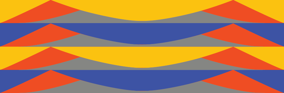
FINALIST #2: Wavy fog over bridge and pyramid
 The fog covers all - creating four micro climates. Golden pyramids, and red bridges are prominent with a historical acknowledgement of our past flag's phoenix.
Finalist #3: San Francisco Square Star


Finalist #3: San Francisco Square Star

Here I finally broke away from direct physical references. It was quite liberating. The angled lines hint at the different street grids. The staggered gray hints at our tectonic fault lines. The "square star" hints at the city's pseudo square shape that is pointy in parts and not really a square.
Color-wise, the gray, gold, red and blue (a lighter blue here) are all here, but green is added to point to our large green parks, our Mexican past, and our hoped for green future.
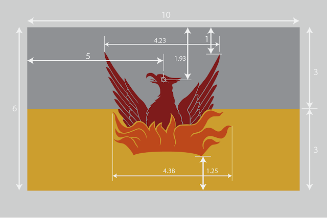
As a reminder, this is what San Francisco's current flag looks like:

Color-wise, the gray, gold, red and blue (a lighter blue here) are all here, but green is added to point to our large green parks, our Mexican past, and our hoped for green future.
As a reminder, this is what San Francisco's current flag looks like:

The evolution of flag designs
My first blog post of a flag for San Francisco seems to have been in August 2013 - four years ago! Where I called for fog and the Golden Gate Bridge. I sure haven't drifted from that theme much.

Two years later, in 2015, I created quite possibly my first San Francisco flag design. "Fog Meets Gate #3". Not sure what #1 or #2 looked like.

A later iteration of Fog Meets Gate had a symetrical Union Jack feel to it.


Experimenting with a more literal looks with weak results

By April 2016, I was finally trying to simplify. This "Sea Hill Fog Bridge" flag tries to do it all while also including the bad. The colors after this got pretty set: gold, white/gray, red/orange, and blue for the history, fog, Golden Gate/Fires, and waters.

I thought the Bay Bridge had been left out too long, so earlier this year I traced out the Golden Gate Bridge and the Bay Bridge spans to scale on top of each other. Nice image, not a flag.
Working of that theme I developed this graphic showing the many skylines of San Francisco:
- Sea with Farallons
- Golden Gate Bridge
- Hills
- Bay Bridge
- Downtown Skyline
Not a great flag, but lots of fun to make.

I even tinkered with other color combos.
Out of that silhouetted bridge and design work I created a more simple design showing gentle undulating fog over the Golden Gate Bridge (reddish orange), with a gold colored Bay Bridge. In this design you find my first hat tip to the current flag's phoenix design.

Here the fog got tapered, while the reddish orange became bolder red.

Time to break out of the mold. Based this design on old San Francisco street maps with Market Street (lower yellow line) and California Street with a bent pier into the bay. Ultimately too abstract and unclear.

How about San Francisco's famous dual street grid with Market St separating the two. A great idea that didn't deliver as a flag design.

More practice trying new themes and designs by going to the Art Deco features of the Golden Gate Bridge towers.

Back to the Golden Gate Bridge and fog themes. The pointy pyramid started as the tower of the Golden Gate Bridge, then morphed into a more stylized pyramid (HT Transamerica Pyramid). I couldn't help but throw in the Ferry Building base. A bit of a kitchen sink.

Now we're on to something.

Some golden flavored fog added in for good measure. Could the four bands stand of fog stand for four micro-climates?

Still it all seemed one step too busy. Of the big themes, which might be the most basic and important to San Francisco - THE FOG.


Hello phoenix!

We're all influenced by other folks an their designs. Below is Mc Allen's proposal for a San Francisco designed flag. Horizontal bands of fog are counterplayed with vertical towers of San Francisco's two bridges and Sutro Tower. Although I liked his fog, Sutro Tower, bridges flag for its content, something didn't click for me. Great vertical features, but felt a bit too literal for a flag. Great use of overlaying and backdrop fog.

My take on the fog and Sutro.

And as a wrap up. Let's look at my three submissions for official flag designs for a San Francisco flag again.
Design #1

Design #2: Wavy fog over bridge and pyramid

Design #3: San Francisco Square Star

You can find more about the details of the study of flags, vexillology from the North American Vexillological Society.
Let me know what you think. What you like, don't like, think is intriguing, what matters, doesn't and more.
-Brian Stokle
P.S. Here are some of the other San Francisco flag redesigns that other folks have made that I like overall or for some design element or theme.
 |
| Design: Burrito Justice |
 |
| Design: DasBirdies |
 |
| Design: Neil Mussett |
 |
| Design: Maz Ameli |
 |
| Design: Michael Greshko |

Sometime I should email you and regale you with the story about a similar situation in SOUTH San Francisco. I worked for a company that was asked to design a flag for them and well...let's just say the results weren't as nice as yours lol. I think they ended up going with the city seal on a flag - blam that's it.
ReplyDeleteThanks for the story and the compliment (I think). I see the South City flag and it looks... like a weird DNA strand. Great for the seal but ugh for the flag. https://goo.gl/images/oqJQfx
Delete