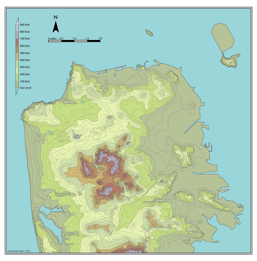
I made this map several years ago. After failing to find a real topographic map of San Francisco that wasn't cluttered with streets, freeways or buildings, I was compelled to make one myself. Meant to show what San Francisco's hills really looks like, the use of atlas style colors enhances the legibility of the map.
I've updated the map twice now. Once on March 23, 2012 (as shown below) and more recently the v.2 map in December 2013. The December 2013 map has more labeled peaks and named features on the land. The border of SF is shown in brown dashes at the bottom. I haven't included Marin in this 2012 version, but the Headlands coastline would be between the north arrow and the scale.
Purchase a Poster and other gear
You can see the older unlabeled original map at the bottom. The "Atlas" "Clean White" styles of the maps are
now available for purchase as a poster, mug, t-shirt, etc. at my Urban Life Signs store at Zazzle.
Related Links
You can also find maps of San Francisco with
25 foot sea level rise here and here and with a 200 foot sea level rise here and here. Also known as the San Francisco Archipelago Map, Burrito Justice and I collaborated on the map and newspaper "story" about the 200 foot rise, as if it were written in 2072. Read the three articles here, here and here.
Interested in San Francisco's less than famous hills? Learn more in my "Forgotten Hills" series. Click the links to find out about Hunters Point Hill, Black Point at Fort Mason and La Portezuela.
 |
| Atlas Style of San Francisco Topographic Map |
 |
| "Clean" style with with white background |
 |
"Clean" style with frame and blue background
|


Hi! I love your work!
ReplyDeleteSince you welcome comments, I would suggest, as a landscape architect,
that typically topographic maps are colored darker at lower elevations and lighter at higher ones.
Looking at your map, I find the differences in hue compete with the differences in value or tonality, decreasing the overall legibility. Try working in an overall tonality or color family.
I am so glad to see a topo map of SF- I looked for one myself not long ago, and ended up using a clean digital model, at the expense of actual lines.
-A
Ashley,
ReplyDeleteThanks for the compliment. Glad you like the work. I'm not a landscape architect, so I'm unfamiliar with the color pattern you describe. I based mine on an atlas I have. It's from the UK, so maybe they do their topographic colors differently.
That said, would you e-mail me, or provide a link to an example of a map with the colors you describe. Thanks!
These look really great! I was trying to find a good quality topographic map without streets, and I stumbled on your site.
ReplyDeleteDo you happen to have a higher resolution of the atlas version?
That's the biggest size I have for online.
ReplyDeleteBeautiful topo map of San Francisco! Thanks for posting.
ReplyDeleteAlthough I know it would depart from your original purpose,it might be helpful for many if you could add indications of a few local landmarks: for example an outline of Golden Gate Park, the Presidio, Mission Dolores Park, perhaps Union Square. It would help place the topography relative to the urban landmarks people are familiar with.
Hi,
ReplyDeleteI like this work but would like to ask you to please adjust the sea level change to the REAL maximum that's known to history - about 186' above today's present sea level. This represents a change of about 14' below where you have it in this work. I think that having it project a REAL possibility makes it more powerful.
I'd be happy to talk to you about this if you'd like... Not sure, though, how to reach you and I'm hesitant to leave my contact information here.
Merci beaucoup, this was exactly what I was looking for! :-)
ReplyDelete