The Fog & Gold Flag for San Francisco
The Fog & Gold Flag is now available for purchase! Find all different sizes and options at www.SFfogGoldFlag.com
The City of San Francisco deserves a compelling, attractive, unique, and symbolic flag. Cities should have a way to rally around their place through a symbol, much how sports fans rally around the colors and logos of their team. Such a beloved, controversial, challenged, sometimes groundbreaking and beautiful city would do well with a flag to show civic pride.
Having a phoenix represent the city that has survived at least 3 major fires that destroyed nearly all of the city is a good symbolic choice. Let's make our flag a more compelling and attractive flag than the current city flag dating from 1940.
 |
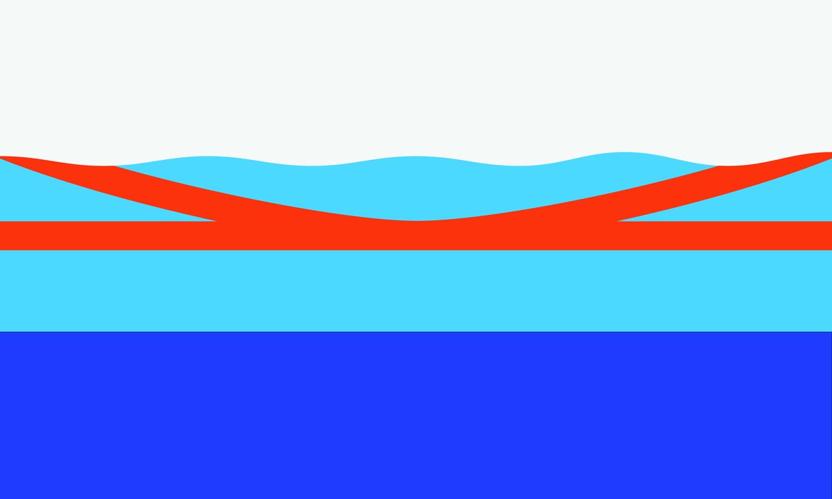
| The Fog & Gold Flag of San Francisco, by Brian Stokle (2019) Flag with 3x5 proportions, shown as 6x10. Phoenix and flames horizontally centered on the eye of the phoenix while vertically centered on where the outspread wings meet the neck of the bird. |
- Keep it simple. The flag should be so simple that a child can draw it from memory. (not sure what age, but let's say a 7 year old since I have one that age.)
- Use Meaningful Symbolism. The flag's images, colors, or patterns should relate to what it symbolizes.
- Use 2 or 3 Basic Colors. Limit the number of colors on the flag to three which contrast well and come from the standard color set.
- No Lettering or Seals. Never use writing of any kind or an organization's seal.
- Be Distinctive or Be Related. Avoid duplicating other flags, but use similarities to show connections.
Ever since seeing Roman Mars' 2015 talk on flags, which highlighted the San Francisco flag, I've been on a personal quest, rather journey, to have a better flag for San Francisco. I wrote about some of my earlier ideas for flags in 2017. Below is my rolling fog flag which is one of the few passable ones. You can also seem my first ever attempt further down. You be the judge on whether its hideous, fascinating or not.

Rolling Fog Flag of San Francisco by Brian Stokle (2017)
Foggy Gate Flag of San Francisco by Brian Stokle (2015)
The bottom line - San Francisco needs a better flag than its current 1940 design. At the core, I just want a good flag to represent the city I love and live in. Whether I design it is irrelevant, but I'll try my darnedest to get a better flag for our city. If it's a design I helped make, or someone else's, so be it.
After crafting many different designs myself, while also being inspired (or disuaded) from other designs for the City, I came to a critical moment when I read John Lumea's most excellent piece on the history of San Francisco's Flag. Titled, "The Original San Francisco Flag Was Better and Cooler. Let's Bring It Back!", Lumea carries us down the path of how the flag was originally designed in 1900, how it was displayed, and ultimately changed to its current less than inspiring design, yet still has some strong elements.
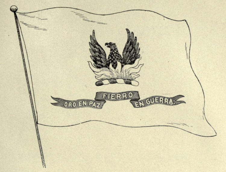 |
| Rendering of the 1900 flag for San Francisco. This appears to be the original drawing submitted by policeman John M. Gamble for his winning concept. Source: San Francisco Municipal Reports for 1899–1900. |
 |
| Current (2020) |
San Francisco's flag does work well on a few of the principles and general good design regarding the following elements:
Principle 2: Meaningful symbol - a phoenix
The flag is "ok" on being simple or distinctive related to the gold border with a white field.
However the flag overall fails on most of the principles:
Principal 1: Keep it simple. The bird is too complicated, as is the ribbon.
Principal 3: Use 2 or 3 colors. The flag's base is rather basic with white and gold, but when you add in the bird, motto ribbon, and city name, it totals six colors.
Principal 4: Never use lettering or seals. The original design had the city motto, and the current flag has the motto and the name of the city on it! "If you need to write the name of what you're representing on your flag, your symbolism has failed." says Ted Kaye of the North American Vexillological Association.
Principal 5: Be distinctive or related: The overall design is not distinctive due to its failure on the other principles, and it looks like a bit of a jumbled mess of text, ugly bird, and ribbons. Two other major cities have a phoenix (Atlanta, GA, and Phoenix, AZ), and that's ok. However I don't relate to the flag or make a connection to my city.
Fog and Gold Design
So I set out to make a flag that used the relatable phoenix that symbolizes the city's resilience after fires in the 1850s, and the rebirth after the Great 1906 Earthquake and Fire. Here is my final design and submission for your consideration.
Elements and symbolism:
1. Phoenix and fire shape are based on the 1929 version of the flag with some minor adjustments, including adding a few feathers to the head, and opening up the eye a bit.
 |
| (caption from John Lumea's blog entry) Photograph of a detail of the original San Francisco flag. This design was executed in 1900 and in use until sometime in the 1930s. The photo, dated no later than 1927, is from the second volume of the two-volume scrapbook, “Album of San Francisco,” compiled by Hamilton Henry Dobbin (1856–1930). Collection of the California State Library. Library catalog listing via Calisphere. |
2. Flame color: International orange like the Golden Gate Bridge
hexidecimal color code #e74000, a slightly deeper red color than official Golden Gate Bridge International Orange and a touch of cyan. I call it Flame International Orange.
3. Phoenix color: Crimson for the loss of life and blood from our disasters, first San Franciscan Ohlones, union workers, soldiers, and activists throughout history.
hexidecimal color code #8d0000, a variant of crimson red. I call it Brown Crimson.
4. Gray: Should San Francisco's flag show our distinctive and well known flag? The answer is a resounding YES!
hexidecimal color code #a7a9ac
5. Gold: The city blossomed into its metropolis state thanks to the California Gold Rush. Gold represents that history, as well as the city's bold pride to take its own distinctive path.
hexidecimal color code #FDBB1B, which is a variant of Golden Poppy
 |
| Fog and Gold Flag of San Francisco, by Brian Stokle (2019) |
1. Order flags from me and hang them out your window.
2. If you'd like to submit your own design or push for a better flag, organize and write letters to your elected officials, and community groups.
3. Sponsor a competition and get a good design panel that represents all aspects of San Francisco and has some good design folks on the panel that understand flags.
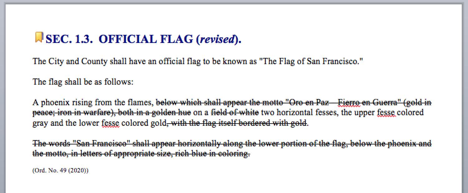
4. Finally, when the City selects a new flag, whether the Fog & Gold Flag or not, ti will need to change the language of the official ordinance, most likely. If Fog & Gold were selected, I'd change the Administrative code.
 |
| Official San Francisco Administrative Code regarding the city's flag design. |
I'll be ordering 3'x5' flags to show with pride from our homes and throughout the city. Who's in?
UPDATE: April 2020
Hey folks, I was able to order flags. Now you can get them by going to the new website: www.SFfogGoldFlag.com.
In addition, there are new Twitter and Instagram accounts: @SFfogGoldFlag
Lastly, take a look at the nice article that San Francisco Chronicle's Peter Hartlaub wrote about the flag, its creation and its meaning during the coronavirus pandemic and the shelter-in-place order.


Yes, we need this.
ReplyDelete