BART's Powell Station now directs people to Powell
Although we love BART, its on time record, its spacious interiors, and its space age looks we've always found its signage and wayfinding seriously lacking. Tourists, visitors, shoppers and occasionally users are often found wondering where to go due to the poor signage. Most of the original 1970s signage is very sparse, and infrequent. At many decision points, where signage is critical, there is either no sign to help you, or the sign at hand provides inadequate or confusing information.
The problem is most obvious at Powell Street Station where shopping, tourism, and conventioneers all pass through – the people who need wayfinding signage the most.
Case in point: although the station is named "Powell Street", not a single sign in the station directs people to Powell Street. Sure, there are signs directing you to Market Street, Stockton Street, 5th Street, 4th Street, Union Square and even Ellis Street and Yerba Buena Center (is that a medical marijuana dispensary?). What an irony that the street a station is named after has no signage directing people to it, even though it is directly below it.
As frequent users of the station we know that one of the exits leads to Powell Street and the Cable Car Turnaround. However, the signage at this exit only points to "Hallidie Plaza". There are several problems with this:
Result: people get lost in the station and don't know where to go. Even if they guess correctly and are drawn the plaza's daylight (in the daytime - not nighttime as in images above) they'll only find out they are in the right space if they know the cable cars are on Powell and they lead to Union Square. That's too many "ifs" in our book. In the end you get a more anxious tourist who's already tired from a long journey and just wants to start off her trip with a nice rest in the hotel, but instead is full of fight or flight adrenaline due to not knowing where to go.
Luckily over the past few years signage has been improving. Modernizations of Embarcadero, Montgomery, and Civic Center have brought much improved wayfinding signage. Powell Street Station has had to wait a bit longer for its modernization, including signage update. Upon passing through the station today, we saw the new signage in its beautiful, helpful and informative glory. Thankfully, the signage now points to Powell Street (giving it the A1 exit title), along with Cable Cars and Union Square.
Now if BART would only provide the same type of signage on its platforms informing them that Muni Metro trains can be easily accessed.
Lucky for us, and especially for tourists and out of towners, the new wayfinding signage is up at Powell Street Station and we now have signage pointing people to.
More pictures after the break.
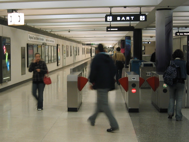
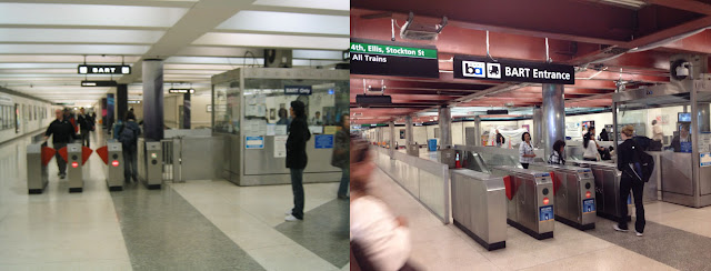
The new BART entrance sign now includes the pictogram for BART trains.
BEFORE AFTER
 |
| Original station wayfinding signage: sparse. Note the sign dedicated to "No Smoking". |
Case in point: although the station is named "Powell Street", not a single sign in the station directs people to Powell Street. Sure, there are signs directing you to Market Street, Stockton Street, 5th Street, 4th Street, Union Square and even Ellis Street and Yerba Buena Center (is that a medical marijuana dispensary?). What an irony that the street a station is named after has no signage directing people to it, even though it is directly below it.
 |
| Hallidie Plaza wayfinding sign. No signs point to Powell Street or Cable Cars |
- The sign is not located at the decision point, where you exit from the BART faregates. Instead it is halfway between the BART and Muni fare gates, and not near the natural path towards the light of Hallidie Plaza.
- Although the "Exit" sign and arrows are lit, the "Hallidie Plaza" name is not lit, as shown in the images above.
- Although we're pleased San Francisco honors the inventor of the cable car with a plaza name, we do not believe most people say, "Meet me at Hallidie Plaza." In fact we believe most people, even locals, don't even know that the sunken modernist plaza is even called Hallidie Plaza.
Result: people get lost in the station and don't know where to go. Even if they guess correctly and are drawn the plaza's daylight (in the daytime - not nighttime as in images above) they'll only find out they are in the right space if they know the cable cars are on Powell and they lead to Union Square. That's too many "ifs" in our book. In the end you get a more anxious tourist who's already tired from a long journey and just wants to start off her trip with a nice rest in the hotel, but instead is full of fight or flight adrenaline due to not knowing where to go.
Luckily over the past few years signage has been improving. Modernizations of Embarcadero, Montgomery, and Civic Center have brought much improved wayfinding signage. Powell Street Station has had to wait a bit longer for its modernization, including signage update. Upon passing through the station today, we saw the new signage in its beautiful, helpful and informative glory. Thankfully, the signage now points to Powell Street (giving it the A1 exit title), along with Cable Cars and Union Square.
Now if BART would only provide the same type of signage on its platforms informing them that Muni Metro trains can be easily accessed.
 |
| Main exit from BART faregates to Powell Street. Note lack of signage. |
 |
| New signage at exit to Powell Street from BART faregates. |
More pictures after the break.
The new BART entrance sign now includes the pictogram for BART trains.
BEFORE AFTER
Likewise, the Muni Metro entrance includes the Muni symbol along with the light rail pictogram.
BEFORE AFTER
The sign showing the sources of funding for the Powell Street Station Modernization.


New signage is up on the station platforms. New hanging signs and even route finding signs. The big omission, however, is no reference to Muni connections. Big disappointment.
ReplyDeleteNice station! Very clean and complete signs those signs are very important to people.
ReplyDeleteThe new ones unfortunately look rather generic. I really like the font and aesthetic of the overhead white on black signs, I wish they would have kept that distinctive design while changing to be more informative.
ReplyDelete